This month we’re spending some quality time with our brand. We’re taking a deep dive into our values, actions, design elements, voice and more. Please join us!
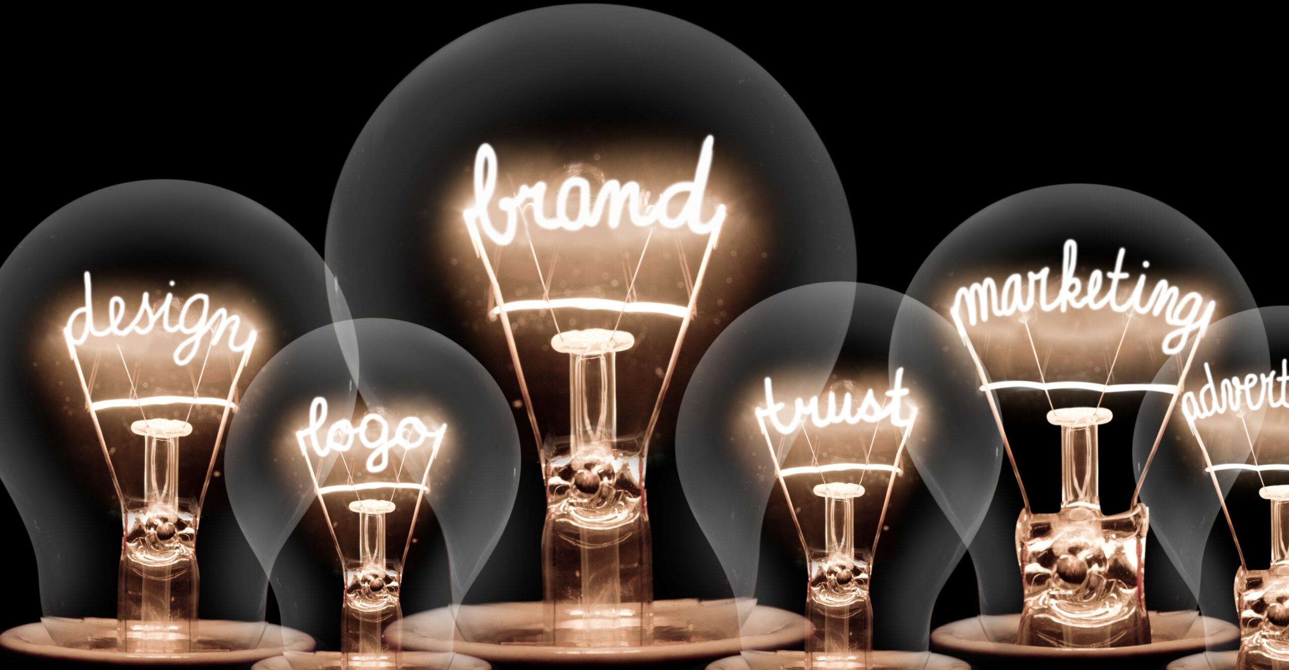
What is a brand?
A brand is much more than a logo. The reason this oft-repeated line is repeated so ‘oft’ is because the other important elements like language, font, style, colours, and visuals that comprise a brand don’t get as much attention as the logo. They are more implicitly weaved into branding but are all equally crucial to a brand’s identity.
The essence of a brand is in how it looks, how it speaks and what it does.
Our logo, font, colours, tone, language, style, and visuals all come together to represent Essex County Council. The visual and verbal elements that go into how our brand looks, sounds, and makes you feel have been carefully crafted to reflect our core values.
As these elements are used consistently across communications, we build a memorable identity, familiarity, and trust among our audiences. If they are applied incorrectly or inconsistently, it dilutes the brand and the trust people have in the brand.
Imagine you pick up your favourite brand of chocolate and see that the logo is just a little to the left of its usual position, or the bar’s packaging is a shade lighter that the usual purple. You’d put it back, assuming it was a fake. You wouldn’t trust it to be the real thing.
Our brand elements
Did you know this about our:
- logo? We have a long version, a centred version and a stacked version of our logo. You might have spotted the long version at the top left of printed documents and the stacked version in our social media posts.
- font? We use Lexend because it is friendly, flexible and accessible and reduces visual stress while reading.
- colour palette? It reflects our brand characteristics like being reliable and honest, and caring and accountable. Our primary palette is red, white and black. We dial up our use of red when we want to show strength or assertiveness.
- photos and illustrations? We use photos that are honest and realistic, and reflect our ambitions and impact. We make sure that our illustrations are warm and engaging with a bold, friendly and simple style.
These are just a handful of the components that constitute our brand. There is a lot more that goes into understanding our brand and making our communications reflect what we stand for. And we want to make it easy for you to understand and apply the concepts.
A Guide to brand for all employees
So coming to your inboxes later this month is a guide to our brand for all employees. It is a handy mini-manual to our complete brand guidelines and is an easy reference for people in and outside of the C&M profession.
We are also reviewing our Guidance this month – as we do on a six month basis – to ensure it is working as hard as possible for us. So should you have any reflections or suggestions, please do share them with design.studios@essex.gov.uk
Leave a comment